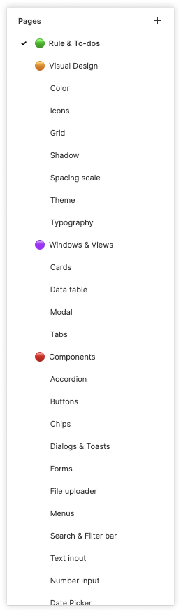
Optim Design System
Design System - Established the style & component guideline

Overview
Optim is a cloud-based service that offers an Internet management platform for ISPs in the US, also a big project developed 2 years ago when Actiontec Electronics Inc. started to transform. Optim originally was developed with various frameworks such as Bootstrap, material design UI, and self-defined styles that as a whole consistency and usability need to be improved, I, therefore, was the lead designer to establish a design guideline for the desktop version when I joined the team.
Time 2021
Handled Tasks
Product vision & strategy
Defining design principles
Brand research
Spot the problem
By the time I initially took on this project, Optim just looked like a creature that combined with limbs from various parents. That components in the same use case used in different ways caused a lot of confusion. As new features kept being added in, and most of them came with sophisticated requirements, the priority of the redesign became a trade-off.
So the challenge was, how might we do both at the same time?
Research
First of all, I needed to know how deep I would be diving in by the time when I actually get started.
So I conducted on the research of
the design system across the most popular ones(Ant design, IBM Carbon Design, Material Design, Apple HIC, etc), Boostrap, Ant Design, IBM Carbon Design, Material Design and Apple HIC,
each feature, the ambiguous design used in the current Optim version
I preliminarily take the idea of Material Design to be the core because of its style similarity with the production and the resource constraints. Communicate with the development team, we agreed on the compromise solution. Instead of rebuilding a brand new design system for Optim, I decided to tune the best practice based on the material design to fit with Optim’s character.
Choose an approach : Atom design + Iteration
Due to the new features being still in progress, components used in different features may not be considered and renovated as a whole, the front-end team decided to try atom design on our implementation, so that we could make sure that changes would cover the smallest elements.
For example, in the first version of the Modal page, for example, I put all atoms together on one page.

View / Modal / Initial version
The modified version, I listed the use cases and types as well as the atoms contained in the component.Also, left some design comments at the corner just in case to show the idea in team discussion.

View / Modal / Modified version

View / Modal / Modified version
Define the tone
So, what’s Optim’s character feels like?
Optim’s current UI display was quite monochrome and text-formed; mixed typography in charts as well as list view, no color-distinguished alert mechanism, techie system message, and purely text-filled error pages which lead to a more techie but less fancy side on the style coordination diagram (upward).

Color Palette & Theme

By the time I just joined the team, Optim’s messy color scheme triggered the idea of the reorganization and theming.
In this project, I did some exploration of the brand characteristics and defined the information architecture, also created a prototype page by device.

Cover

Screens - Components

Playing around dark and bright
The Details
Cover
In the beginning, to set up the design system so that the file for each component and pattern has the same category. Also, to give a quick understanding of what design process a file was currently in, I added a status label enclosed in brackets to the file name. However, this didn’t make it more recognizable.

Before
After
Besides removing [the progress label] from the pages title, I also made a cover for each file, which clearly shows what design state a component is in.


A simple title area includes the component name along with its current stage(blue), the stages that it had been through(green) and the stage it haven’t/never been through(grey).
Naming Rule
Also, to better organize the new components and distinguish them from the old version, I defined the naming rule for each type of component along with a token(e.g. .state) , which make everything could be used in various use cases.
Coverage from wide to narrow, say, screen to component:
File name / Page name / Frame name / Component name (variation, style, type & state)
👉 One more thing - Token
I was thinking to bind the naming rule with token.
In the midway of the design, I found some Figma token plugins are really helpful in terms of reducing the communication cost between designers and developers.
For example, Figma Token and Toolabs Design System Manager are the token plugins I really like.
In some cases when I am just testing a couple of ideas, it helps me define and update tokens in one single panel without going to the main component to adjust the design in Figma, and updating it to the library. In other cases that I already defined the specs and exported them to the library, the plugin can just bind them with the token I just created together.
Take Spacing for example, I used to use Redline or even one-by-one manually to annotate the spacing between elements, with design tokens, it does save a lot of documentation time.
Some screenshots for example in the toggle list

The spacing scale I originally made by shapes vs the token plugin

Applying the defined rule with one click through the plugin panel

Applying the defined rule with one click through the plugin panel

Figma Token
Iteration - Test, test, test
Current strategy: Test in feature, follow the guideline.
To know how the usability of each component being used appropriately, I conducted a series of testing steps by feature to get feedback from developers, PMs, and some technician users, yet the time and human resources are so limited that it ended up being just MVP.
Handover
Documentation: for each component
Types/Variants(behavior, use case, user flow),
Formatting specs(anatomy, alignment, placement),
Content,
Related components(exchangeable cases)
Prototype(interaction-focused)
Some screenshots for example below.

Component Variantes

Component & Specification

Component & the Use Case /w Illustration

Discussion on the two methods for form button action
Future Forward - Systematize
Making a design system was the initial goal, at this point, it’s just more like an asset library with a style guideline.
To make it more a real system , there is some work we can move forward. Such as
a more organized file structure
pattern
changelog
branding style (currently we apply MUI quite a lot)
accessibility
Takeaway
The art of being consistent yet flexible -
Unlike designing a standalone product where you have full control over the end-to-end experience and a clear scope at the beginning, designing a design system require taking care of the usability and audiences’ origin impression of the brand itself, also communicating with each party(the executives, marketing team, product team, etc) to get the consensus. As a result, when the requirement party had slightly different elements or interactive behavior based on their unique user needs or technical constraints, my goal was set to find that balance between consistency and customization.
