E.SUN Mobile Payment
Mobile・Finance・Redesign
Overview
E.SUN bank is a commercial bank rooted in Taiwan, whose user experience rating on mobile app has kept being highly praised and appreciated over other local banks in the area of Taiwan. The project is one of the feature redesign covering functions of various type of transaction record sorting, reviewing and data updating.
Role
System analysis, UX design
Timeline
Nov 2018 − early 2019
Outcome
High-fidelity mockup
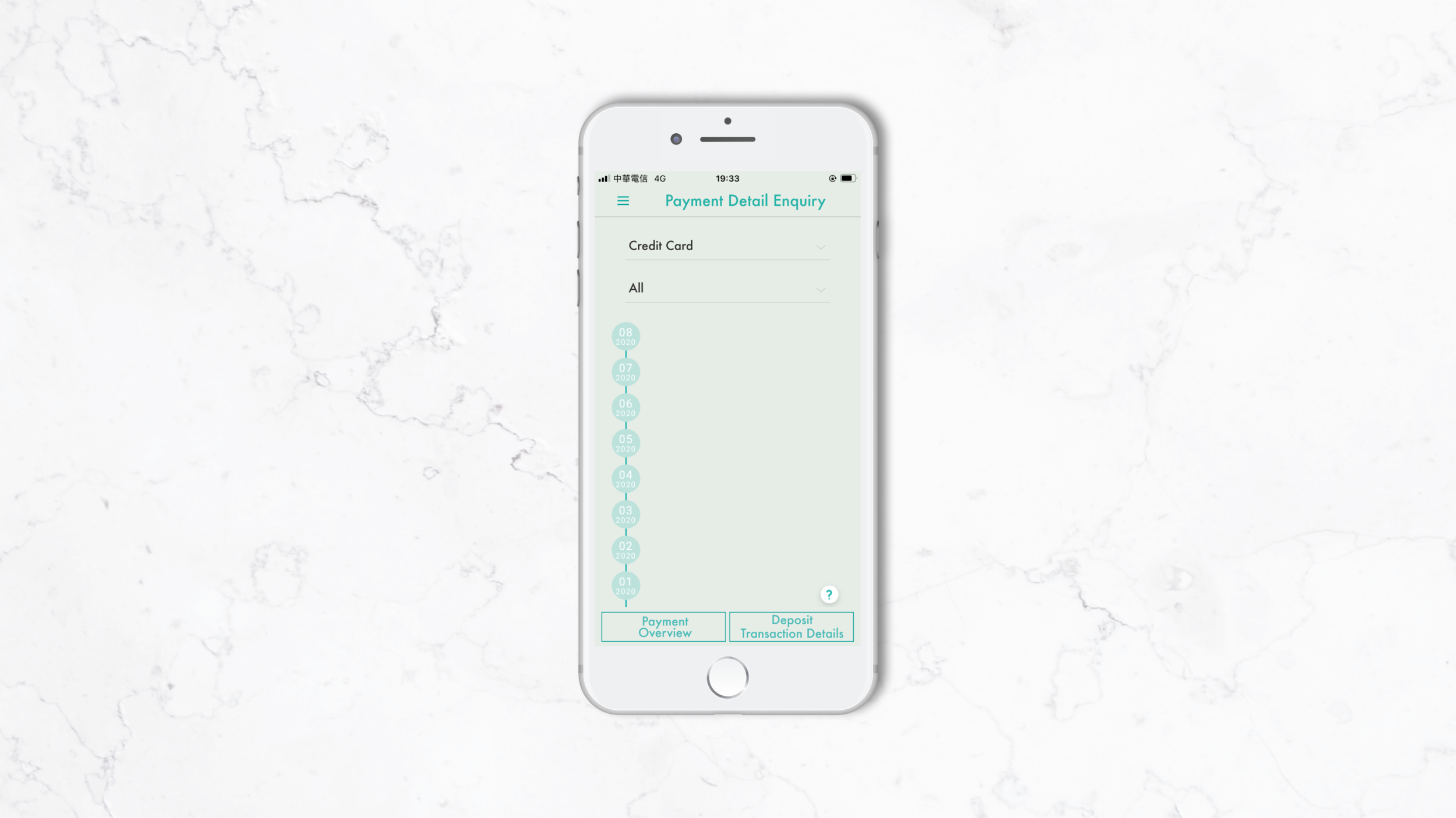
A new demand for payment enquiry
Enquire/Delete Scheduled Bill Payment Transaction, the feature needed to be redesigned due to a new payment item has been added in. The new payment item, dual-currency credit card transaction, carrying with different currencies and payment statuses. It brought the influence for the function across most of the existing elements on the pre-enquiry setting features, such as wording for payment items, payment amount format and the payment categories list.
Then…

How to cleverly keep the enquiry experience simple when the inquiry objects increase?
What I did
In addition to scope defining, I led the ideation process, created technical document, high-fidelity mockup and integration testing. Here are two tasks within that I’d like to highlight:
Stakeholder Communication
I shared my high-fidelity mockup and design recommendations with senior leadership to highlight how new features can provide better usability based on the existing payment enquiry service for end users. This helped to gain buy-in and inspire a new way of thinking about features creation.
Mobile App Design
My final design took form for mobile device. Considering the compatibility and eligibility on web view and different mobile system from various version, I did this to accommodate multiple use cases and have the design meet users where they are at, since business encounters don’t always occur inside the of the office.
Design process
Involving in the project as a system analyst originally, I firstly focused on technical aspect in primary to conduct the feature design. Soon received team members’ feedback after the first internal proposal presentation, I steered the design direction toward user experience enhancement through deeper and wider development in use case with the SA team and the supportive UX designer.
About the simplicity…
In the past, as users entered the enquiry page, they firstly saw their latest six-month credit card transactions record for all statuses. Afterward, users can enquire other payment items or statuses by the drop-down menus on the top of page. In terms of the content of each payment card, there was always a dollar sign shown as a prefix of payment amount, same text size for everything on card. Moreover, in case of using Taiwanese dollar, a decimal point has no need to follow after the payment amount.
Based on the design, it would become a bit more complicated as the new payment item joint. Yet, the solution should as well keep the feature as simple and easily used as it was.
Before-after iteration
The challenge
In order to keep the consistency with the whole app and minimize the change, it took me a while to iterate the entering view for the feature. Some tradeoffs that might influence other related features needed to be mulled over and make, such as showing dollar sign or not, and setting default selection item and/or status for users or leave the first selecting for them. As well as considering the limited amount of word for each section on a payment card, the payment title for example, as we put on “Dual-Currency Credit Card-USD“, it’d either break up into two lines or squeeze the space for the texts next to it then consequently broke the consistency from other features of the app.

Some examples.
Default void v.s. Default selected | Three-step pre-enquiry v.s. Two-step pre-enquiry
Therefore, I specifically had 3 key questions I tried to answer during the iteration process:
Is the change necessary, yet unobtrusive?
Does the user understand why they were getting default enquiry suggestion?
Does the user find the solution more convenient than the alternative?
“Perhaps, the redesign is all about the details.”
The assumption came from the feedback for the initial idea, which indicated that there was no need to make any big distinct change for the current design.
I summarized the differences between current design and the redesign were in details instead of a whole. As to each single concern I had had can therefore find a way to resolve. The potential solutions to head for the next step are:
Trimming the wording for the payment title to fit the layout,
Only keep the decimal in the currency that needs it,
Removing the dollar sign,
Setting the most enquired item as the default enquiry value to minimize decision making and speed up the enquiry process.
・・・Find the bearings
With that in mind, I provided two versions for client to deliberate, the primary difference lied in the numbers of the dropdown menus.
__
Version A
For version A, users select payment item and status to set the enquire target. I broke all of the payment items down from their belonging categories in current structure and reordered them in the new payment item menu by adjoining items that used to categorized together. Although the new payment item menu became much longer than it used to be, it benefited the user flow with simpler and more intuitive operation.
Key Screen Wireframe - Version A

Item card examples
Version B
On the other hand, the version B, inherited from the current design without dual-currency CC added in, allowing users to select payment category, item and status, which means that one more action needed to be taken to finish the pre-enquiry setting.
Through a three-layer setting could not only make the each dropdown menu shorter, but also make the connection between payment item and its category stronger, which might assist users to easier recall the item position while using.
Key Screen Wireframe - Version B
A-B Comparison
As a result, the version A, a two-step enquiry setting got more stakeholders’ buy-in. The user testing result indicated that knowing clearly about the payment category wouldn’t help at all for finding the target item that the users were looking for.
Version A performed as the better solution on two aspects:
Functionality
As an enquiry service, all the features within should enable the function to serve its purpose. Users had already known what they wanted as they entered the page, and they weren’t likely to remember which item belonged to which category when the hierarchy became more complicated. Version A demonstrates a simpler hierarchy both in visual and using.
Recognition
The item name and what it has been positioned with on the page were the keys for users to quicker find their enquiry target from the list; version A provides a single list that orders items by relation helps improve item’s recognizability.
・・・What I learned
A new perspective on principle following
My opinion toward design guidelines reformed from restricted to extendable and flexible.

When conducting the use case research and initial wireframe for the function, I had come up with some “creative“(yet brave) ideas for the solutions. However, I quickly realized the advantage and necessity of guidelines following. The UI/UX guidelines, no matter it’s iOS or Android, were made by UX specialists in Apple or Google who spent significant amount of time and effort conducting UX research and usability tests, and therefore to come up with logical solutions to navigate on a small piece of glass. Those solutions are not just for some specific use cases, but can be widely used in almost all the scenarios, taking many steps further into consideration.